This post is a brief explanation for non-experts of a graphing technique you might have seen but not completely understood. As always, we’ll go over some necessary concepts first.
Complex numbers
If we want to solve an equation like x2+1=0, we get stuck because we need to take the square root of -1, but no real number becomes negative when multiplied by itself. A positive times a positive is a positive, a negative times a negative is a positive, and zero times zero is zero. In order to investigate such equations more fully, we can posit an imaginary number i defined by the equation i2=-1. This imaginary number can be added, subtracted, multiplied, and divided. For example, i+i=2i. As we can see, imaginary numbers and real numbers can be combined in certain ways. In general, we can talk about complex numbers, named as such because they contain a real part and an imaginary part.
A complex number has the form a+bi where a and b are real numbers. We call a the real part and b the imaginary part.
The complex plane
We frequently use a two-dimensional space, or plane, to graph points and functions. A horizontal axis, which is really just a number line, represents the independent variable usually called x. A vertical axis (number line) represents the independent variable (y).
Instead of x and y number lines, we can think of these axes as a real number line and an imaginary number line. Any point on the plane represents a complex number. For example, the point (2,3) represents the number 2+3i. Numbers along the horizontal axis are pure real numbers and those along the vertical axis are pure imaginary numbers.
Polar coordinates
Typically when using a coordinate plane, we represent a point using coordinates like (x,y) where the first number tells how far along the horizontal axis the point is and the second number tells how far along the vertical axis the point is. This system is often called Cartesian coordinates.
An alternative system that is sometimes easier to work with is called polar coordinates. Here, we draw a line segment from the origin (0,0) to our point. The length of this line segment, r, is often called the modulus or the magnitude. We also measure the angle this line segment makes with the positive real axis. This angle, θ (Greek letter theta), is often called the argument or the phase. We then write the coordinates of the point as (r,θ). Instead of telling us how to go in each direction horizontally and vertically, polar coordinates tell us how far to go and in which specific direction.


Complex functions
Recall that a function associates objects in a domain (“x values”) with objects in a range (“y values”). The functions we see most often have their domain and range each within the real numbers. These are generally referred to as real-valued functions. If we want a complex-valued function, that is, a function that takes a complex number as input and gives a complex number as output, we can’t graph it on a 2D plane the same way we do with real-valued functions. For real-valued functions, a point on the plane represents both input and output, i.e. two real numbers x and y. For complex-valued functions, however, a point on the plane represents a single complex number: just the input but not the output.
A real-valued function goes from a 1D space (the real number line) to another 1D space, which is why the relationship (the function itself) can be represented in 2D. For complex-valued functions, we go from a 2D space (the complex plane) to another 2D space, meaning we would need four dimensions to produce a graph. While a 3D image cannot be represented perfectly in 2D, it is possible to draw a picture of it. A 4D image, however, cannot be visualized in any straightforward way at all.
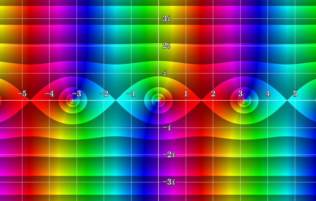
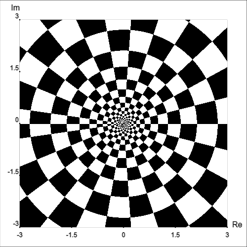
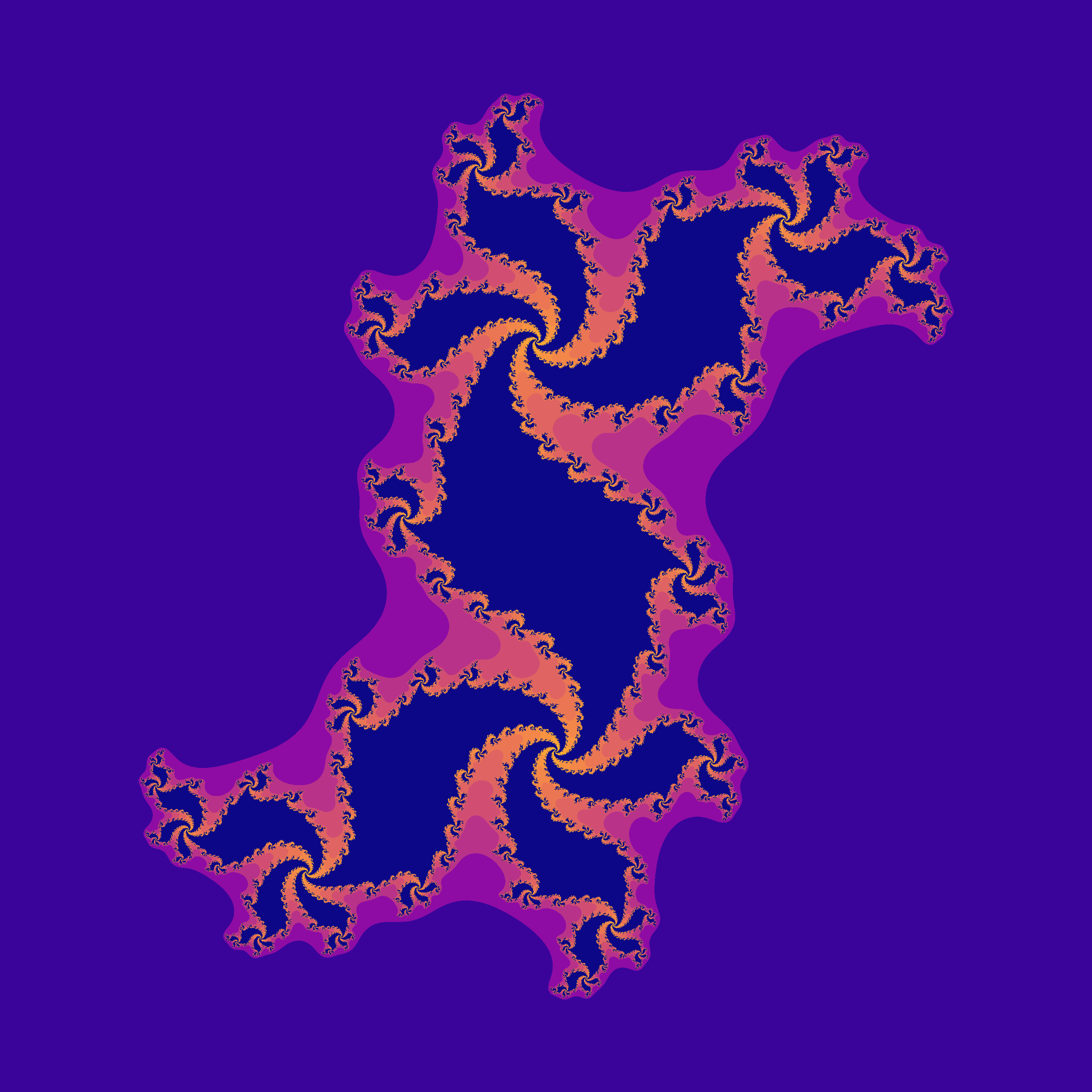
Domain coloring
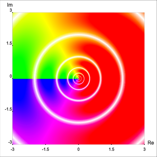
Mathematicians have developed a clever way of getting around this problem. First, we will think of the output of a complex-valued function in terms of polar coordinates. At every point in the complex plane, we need a way to represent the magnitude r and the phase angle θ. Since color (hue) can be represented as a wheel, we can use this to represent an angle. For example, 0° is red, 180° is cyan, 270° is purple, and so on.

A major drawback of this approach is that it is somewhere between difficult and impossible to interpret for people with color blindness. More on this later.

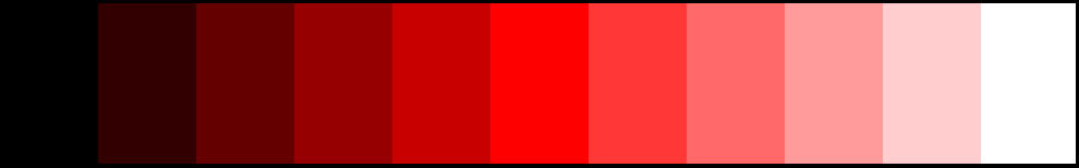
For magnitude, we can use value (also called brightness or lightness) from 0% to 100% followed by saturation from 100% to 0%. This ranges from a minimum value (black) to a maximum value (white).
Note that in this scheme we do not mix variation in value with variation in saturation. In other words, shades of gray will never be included.
Also note that the actual possible magnitudes are from zero to infinity (nonnegative real numbers). This means that a finite scale like this cannot perfectly represent magnitude. Instead, we must pick a maximum magnitude that is appropriate for our situation or repeat the scale every time the magnitude exceeds some factor of our choosing.


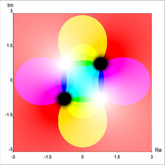
To summarize, the location of a point on such a graph represents the input complex number z. The hue of the point represents the angle of the output complex number f(z) in polar coordinates, and the value/saturation of the point represents the magnitude of the output in polar coordinates.
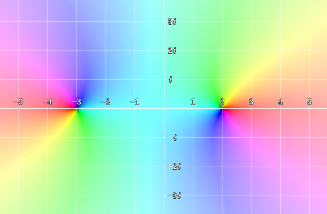
Examples
Frank A. Farris coined the term domain coloring in 1998, although the concept may have been developed independently as much as two decades earlier. The example below shows the following function:
This is from his 1998 review of Visual Complex Analysis by Tristan Needham, although full color images were not possible in the article. The actual image comes from his associated web page Visualizing complex-valued functions in the plane.
More examples:


Drawbacks and different approaches
First, let’s return to the issue of color blindness. Under most circumstances, a graph like this is not totally inscrutable, but a lot of information is lost.

In some situations and with some types of color blindness, it may be possible to create a more useful color map (i.e. a color wheel that makes sense to someone with color blindness). This may be particularly effective when combined with some of the techniques described below.
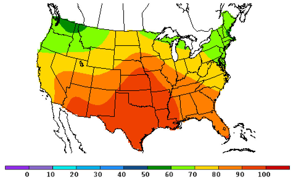
Level curves aka contour lines aka isopleths
There can be many different names for these curves depending on the context, but I will call them isopleths in general, because I like that word.
You have probably seen topographic maps and weather maps before. These are related in that they (often) feature isopleths. An isopleth is a curve along which a specified quantity stays the same. This quantity could be elevation (as in topographic contour maps), temperature (as in isotherm maps), air pressure (as in isobar maps), depth below sea level (isobath), water salinity (isohaline), amount of rainfall (isohyet), and on and on.
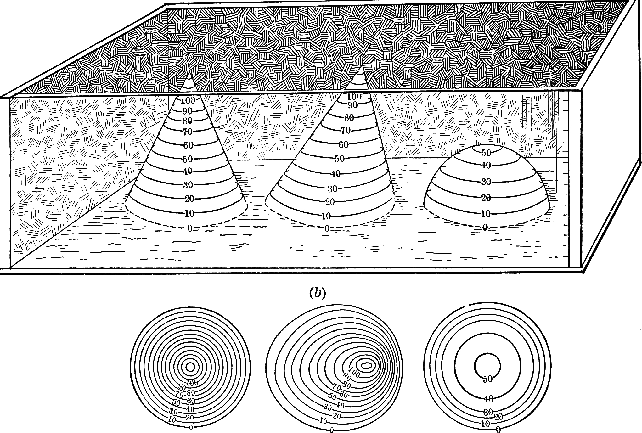

So, the idea is that we can use this same technique to make graphs of complex functions more informative. There are several pieces of information we could use to make these curves: magnitude, phase, real part, imaginary part, and there are other possibilities as well. Recall that, thinking of complex numbers as points on a complex plane, magnitude is the length of a line segment from the point to the origin, the phase is the angle this line segment makes with the positive real axis, the real part is how far along the real axis the point is, and the imaginary part is how along the imaginary axis it is.
Example: 12.3-5.02i (values below are approximate)
- Magnitude: 13.285
- Phase: 337.798°
- Real part: 12.3
- Imaginary part: -5.02
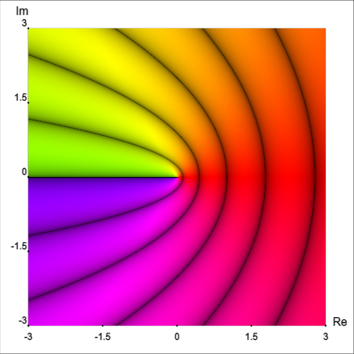
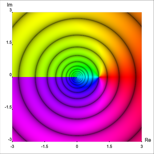
We have actually already seen a kind of contour graph with the discontinuous gradient described above. In that situation, the value that is the same along a level curve (contour) is magnitude.
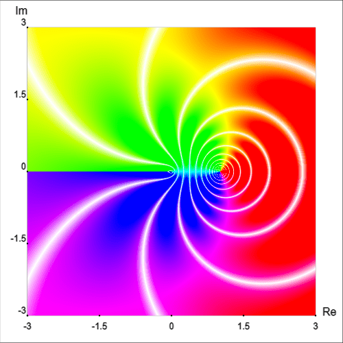
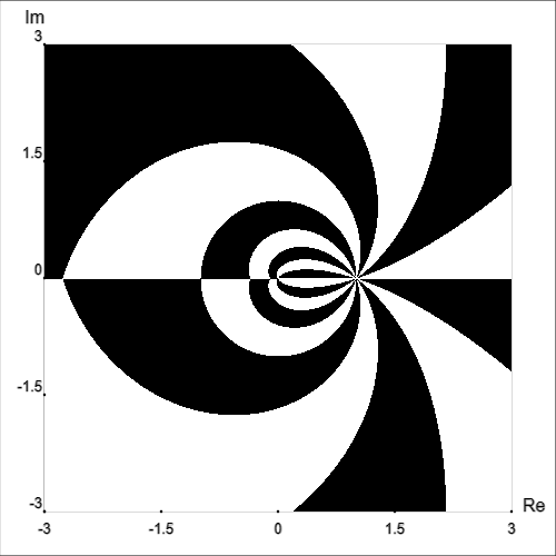
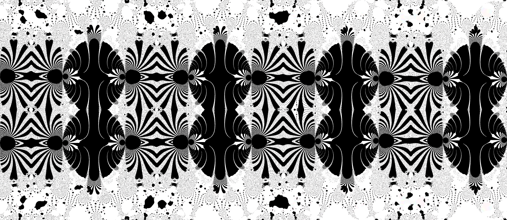
We can also draw multiple types of curves at once, which in some cases can be informative and in other cases can be too cluttered to be useful.
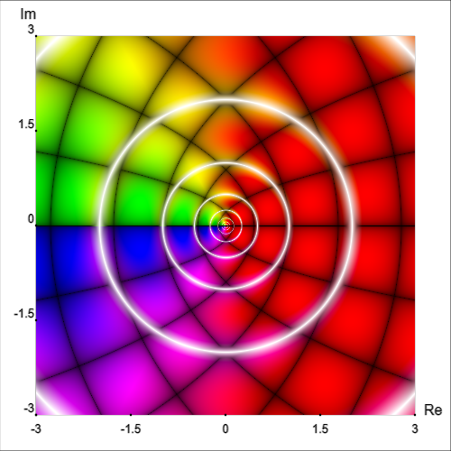
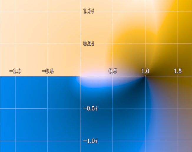
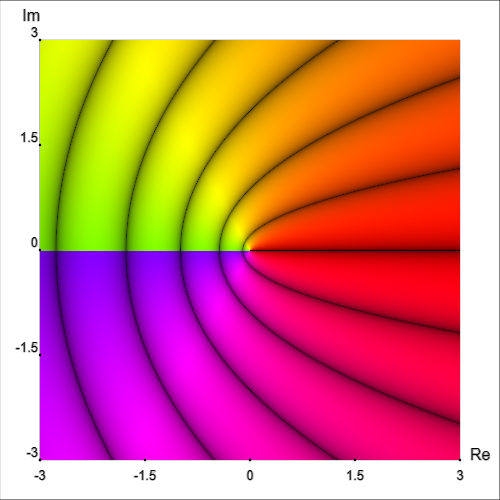
Let’s return to the function f(z)=log(z), which was used in the color blindness comparison above.

In the examples above, phase angle was still indicated using color hue. However, we can remove color from the equation (no pun intended) entirely:


Clearly, we lose a lot of information by doing this. However, if we want to, we can use this to look at each quantity (magnitude, phase, real part, imaginary part) separately; or, as seen above, we can even depict multiple quantities’ level curves on the same graph.

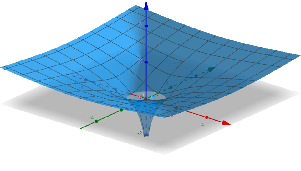
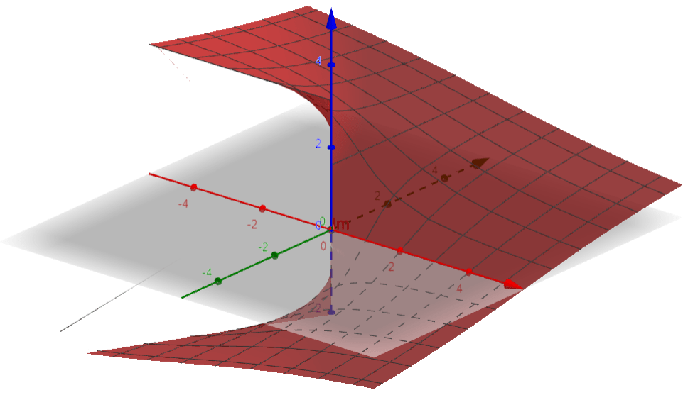
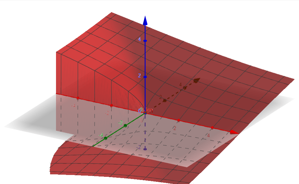
3D surface graphs
A different approach is to create a 2D perspective image of a curved surface in 3D space. There are different ways to do this as well. In the examples below, vertical height represents magnitude, hue represents phase, and level curves (contours) show equal real part or equal imaginary part. In many cases, this provides a much clearer picture of what is going on.

This can also make the graphs far easier to understand for people with color blindness. Below is a graph of f(z)=log(z) as seen in trichromatic and deuteranopic vision (adapted from an image by Leonid 2, both versions below licensed under a Creative Commons Attribution-Share Alike 3.0 Unported license).

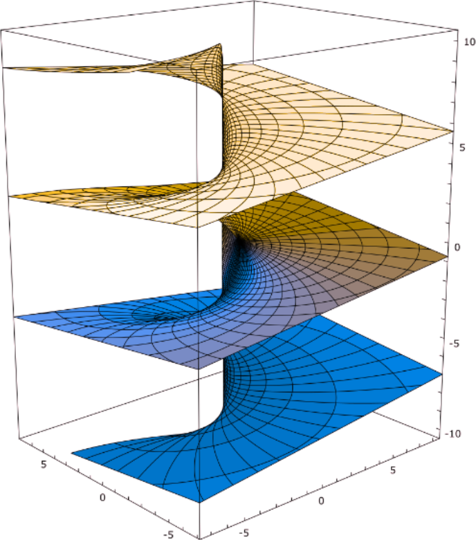
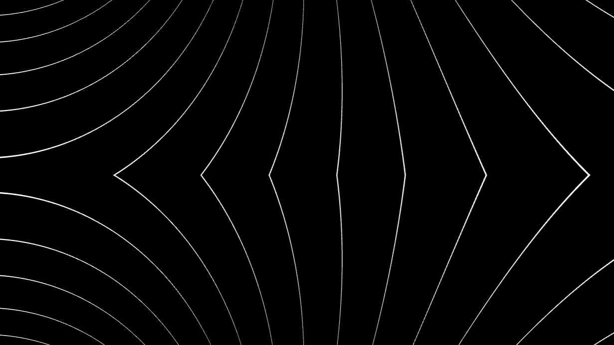
We can also make 3D graphs that do not rely on color coding by graphing a single relevant quantity, such as real part or imaginary part. Note that the lines in the examples below are not contour lines, but rather show the underlying grid of the complex plane.

Considering complex graphs in summary
No graph perfectly represents a function, relation, or data set. Graphs (as in the images themselves) are not as rigidly defined as many other things in math. The purpose of a graph is primarily to provide humans, who tend to be highly visually oriented, with a convenient way of understanding certain kinds of information. When creating a graph, it is important to consider what kind of information you are looking for or trying to show your audience.
With most ordinary 2D graphs of real-valued functions, there isn’t a great deal of variation in how the information is presented. However, since complex-valued functions cannot be visualized in a straightforward way, there is a great deal more room (and indeed, necessity) for finding creative ways to see and understand important features. This requires good judgment on the part of the person making or preparing the graph.
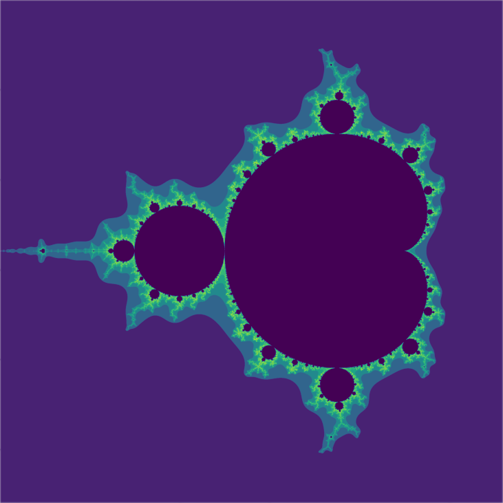
Confusingly, many graphs use color-coding to mean different things, including some notable examples relating to complex numbers. One type of graph uses a color map or color scale to indicate the number of iterative applications of a function it takes for the output’s magnitude to exceed some threshold. Recall that each point on the plane represents some complex number z. If we have some function f(z) and a threshold of, say, 5, our algorithm might do something like the following:
- f(z) has a magnitude of 0.2, below the threshold, so apply the function again.
- f(f(z)) has a magnitude of 2.4, below the threshold, so apply the function again.
- f(f(f(z))) has a magnitude of 3 below the threshold, so apply the function again.
- f(f(f(f(z)))) has a magnitude of 12.1, above the threshold.
Since it took four iterations in our example to exceed the threshold, we would find the color corresponding to a value of 4 on our color scale and color the point correspondingly.
This is notably used to create images of fractals including the Mandelbrot set and Julia sets.
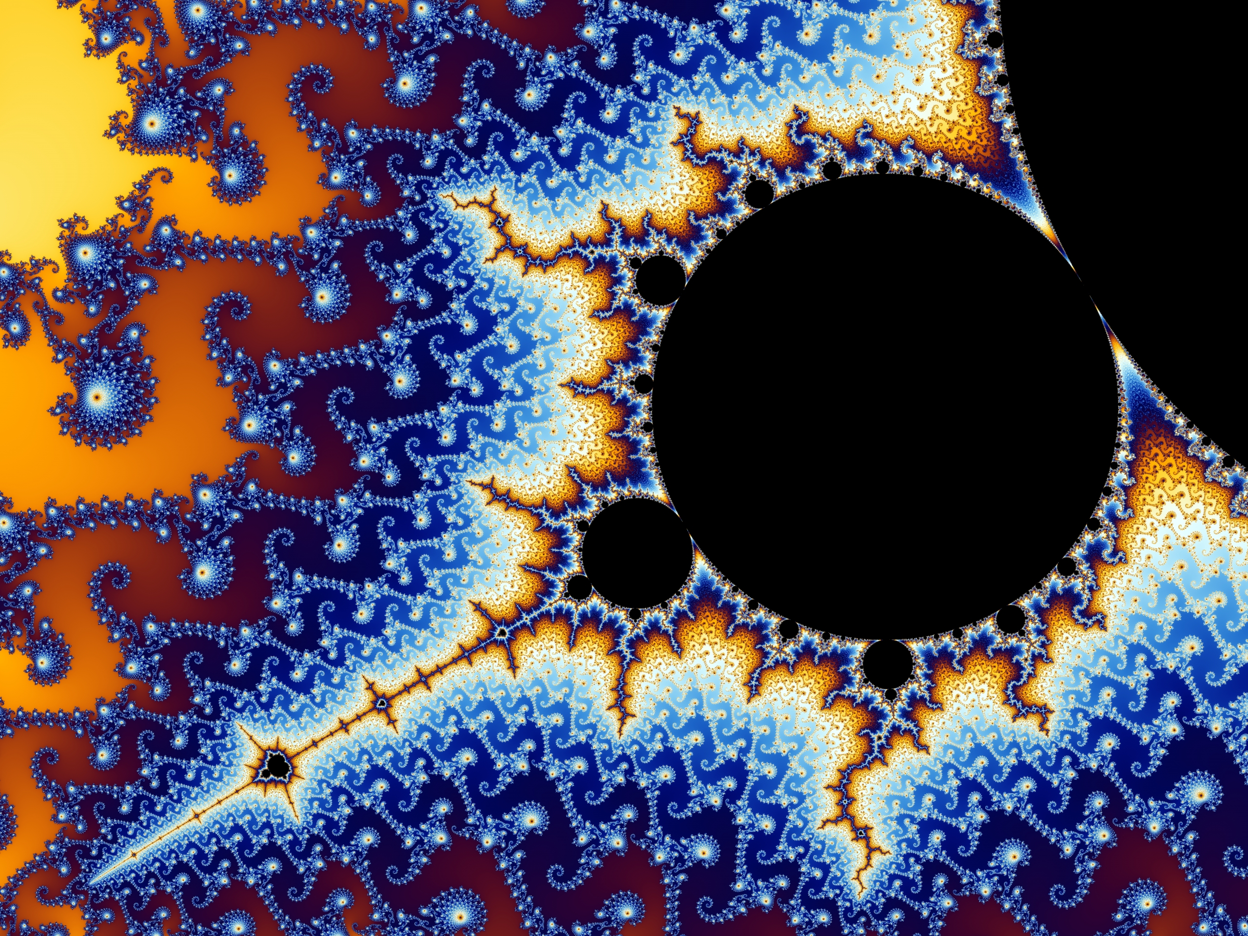
However, fractals are a topic for another time. My point is that many different types of graphs (complex or otherwise) are shown to general audiences (i.e. mathematical laypeople) with little to no explanation. At best this can prevent people from fully appreciating the information that is being shown to them. At worst, it can create misunderstandings and misconceptions. Graphs must be both created responsibly and explained properly for the intended audience. For mathematicians, something like “color represents argument” is sufficient. To the average person, this phrase is incomprehensible.
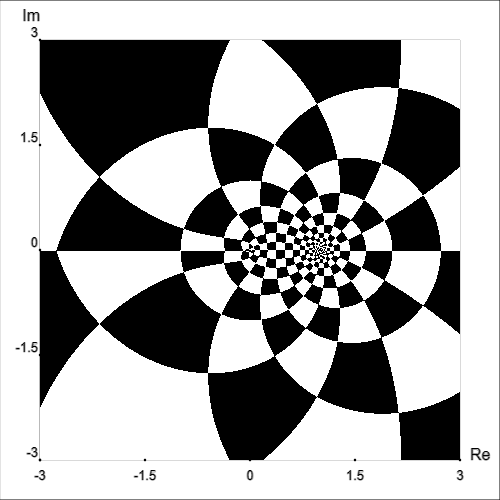
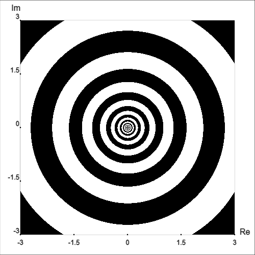
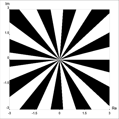
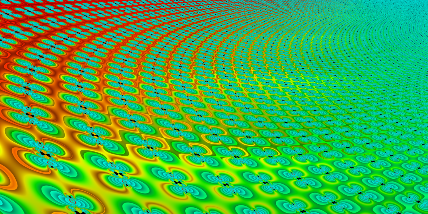
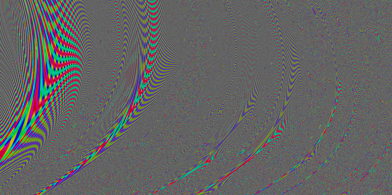
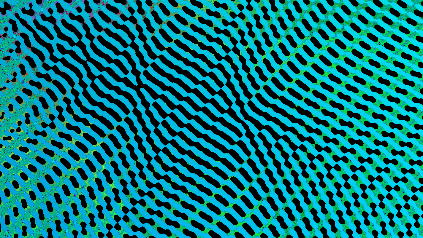
I will add that using graphs to create images for purely aesthetic purposes is wonderful, however this must be understood as an artistic endeavor and not one of mathematics communication. Mathematically meaningful images can also be beautiful (and often are), but again require proper context and explanation.
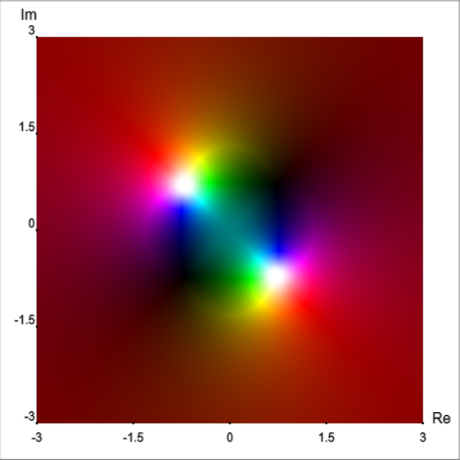
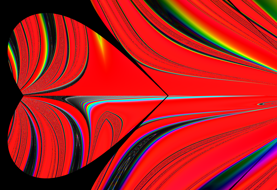
Below are various examples of “artistic” complex graphs I have created. To give some context, I will provide the equation used to create the first one (“Green chevrons”): f(z)=log(log(log(Γ(z))))*i2+i. These images were all created using Samuel J. Li’s complex function plotter. Also, you have my permission to use these images for any purpose if you wish, but I request that you give credit to Li for his graphing tool.


Resources and references
Complex function plotter by Samuel J. Li
Visualizing complex functions with domain coloring by Juan Carlos Ponce Campuzano
Geogebra graphs of complex functions by Juan Carlos Ponce Campuzano
Contour maps in math by Khan Academy
Color blindness simulator by Colblindor
NOAA daily weather maps by the National Centers for Environmental Prediction, Weather Prediction Center
Farris, F. A. (1998). Review of Visual Complex Analysis, by Tristan Needham. American Mathematical Monthly 105(6), pp. 570-576.
Finch, J. K. (1920). Topographic Maps and Sketch Mapping. First ed.
